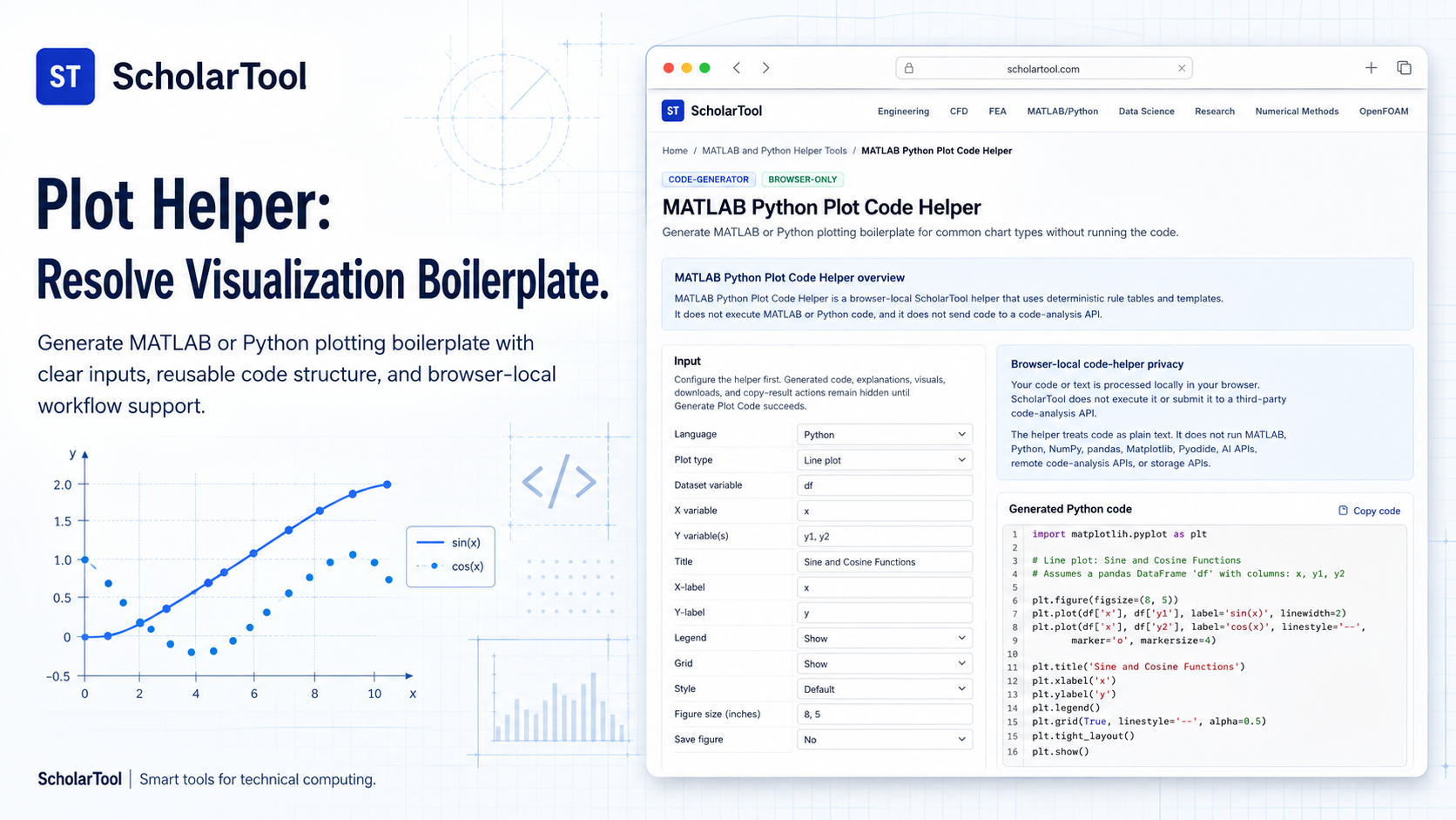
MATLAB Python Plot Code Helper: Matplotlib & MATLAB Starter Tool
When I am auditing a numerical simulation or preparing a research report, the “final milestone” is almost always the visualization of results. As I have observed in technical manuals like An Engineer’s Guide to MATLAB, MATLAB is a matrix-native environment where plotting is an integrated, core command. Moving to Python, however, requires a shift toward library-dependent syntax. As Hans-Petter Halvorsen notes, Python relies on the Matplotlib package for scientific visualization, which introduces the friction of explicit imports and object-oriented boilerplate.
What I find indispensable for clearing this hurdle is the MATLAB Python Plot Code Helper from ScholarTool. It is a deterministic, browser-local utility designed to generate starter code for common chart types without executing the code or sending it to a server. Whether I am drafting a quick scatter plot for a teaching lab or building a complex dual-axis chart for a peer-reviewed paper, this tool ensures my visualization assumptions are mathematically sound while keeping my proprietary data entirely private.
What the MATLAB Python Plot Code Helper Helps You Do
The primary purpose of this tool is to speed up routine syntax translation and template drafting for scientific charts. In technical terms, it selects a static plot template and substitutes your validated variable names and labels into a deterministic code block. Unlike AI-based generators that might guess based on a black-box model, this helper provides a “math receipt” of rules applied to your specific plot configuration.
I find the interface particularly helpful because it provides a “Comparative Perspective” between environments. You can configure a plot and see how the syntax differs between MATLAB’s functional commands and Matplotlib’s pyplot idioms. What I appreciate most is the “browser-only” architecture. Because the helper treats your input as plain text and processes it locally using TypeScript, your sensitive variable names proprietary research labels or internal data structures are never submitted to a third-party code-analysis API or storage service.
Inputs You Can Use
The interface is built with a configuration-first layout that allows you to define your plot characteristics before generating the snippet.
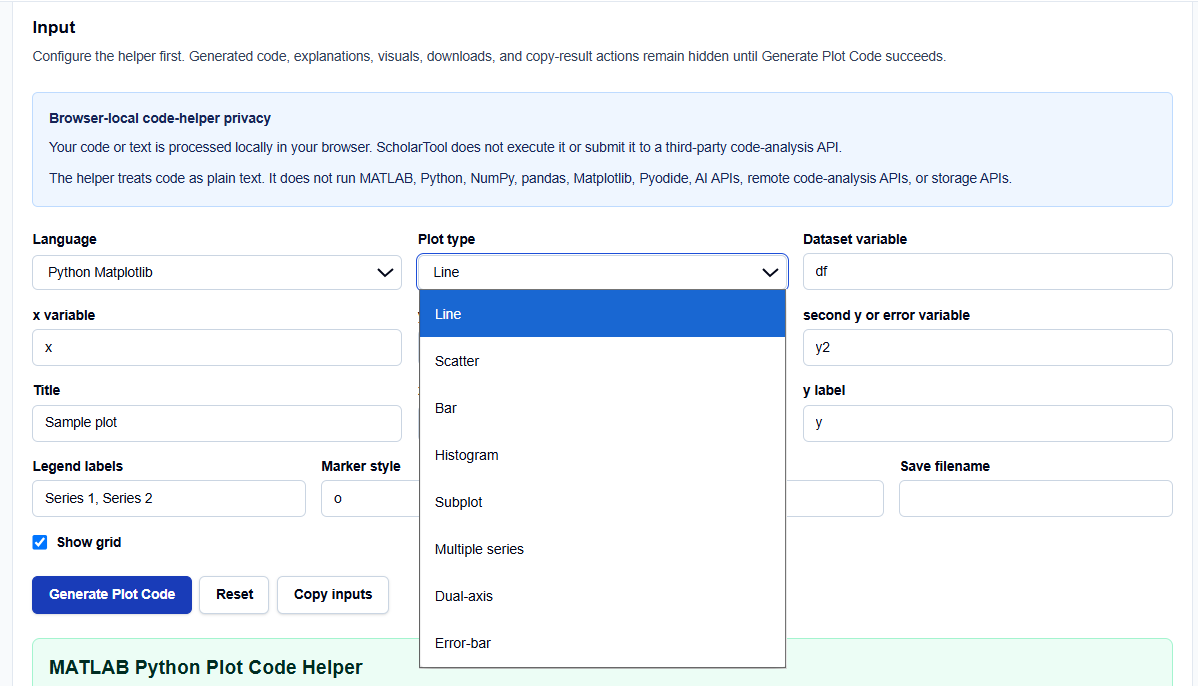
Language and Plot Types
I start by selecting the Language: MATLAB or Python Matplotlib. You can then choose from eight supported Plot types, including:
- Line and Scatter: For continuous and discrete data points.
- Bar and Histogram: For categorical data and distribution analysis.
- Subplot and Multiple Series: For comparing datasets in a single figure.
- Dual-axis and Error-bar: For complex engineering correlations.
Variables and Style
Once the type is set, you enter your Variable names (e.g., x, y, y2). You can further customize the Title, Labels, and Legend. I find the style options particularly useful; you can toggle the Grid, select a Marker style (like o or *), and define a Line style.
How I Use the Tool
My typical workflow begins when I need to migrate a plot idea between MATLAB and Python. For instance, if I have a simple dataset in a Python script, I open the helper, select “Python Matplotlib,” and choose “Line”.
Once I enter my variable names and labels, I click Generate Plot Code. I appreciate that the results remain hidden until this action succeeds, ensuring I don’t mistake stale examples for my own output. I then review the Output explanation and any Warnings provided. Because the tool is deterministic, I can audit the generated import statements and plt.show() calls as a “math receipt” of the visualization logic. After the check, I copy the resulting code as “starter text” for my own IDE.
A Comparative Perspective: MATLAB vs. Matplotlib
From a comparative perspective, the tool highlights the fundamental philosophical differences between the two languages.
- MATLAB: The code is concise, often including the plot(x, y); command along with xlabel and grid on in a procedural style.
- Matplotlib: The snippet explicitly includes import matplotlib.pyplot as plt and uses the plt. prefix for every call, such as plt.plot(x, y) and plt.show().
Seeing these side-by-side allows me to maintain consistency across my research prototypes and ensures that I am following the idiomatic standards of each environment.
Understanding the Results
The result section provides the Generated MATLAB or Python code prominently at the top. However, for a professional audit, I pay close attention to the Warnings and Interpretation sections:
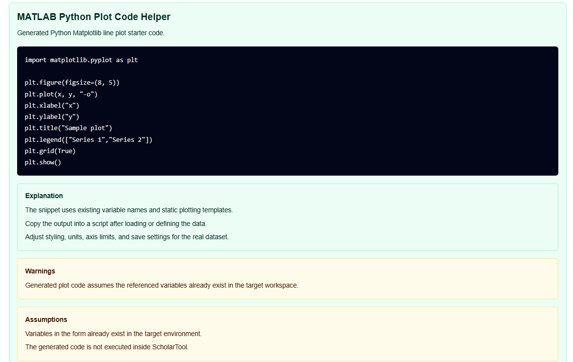
- Variable Assumptions: The tool warns you that it assumes your named variables (like df) already exist in your workspace.
- Dual-axis Hazards: It provides a vital professional reminder that dual-axis plots can be misleading because scaling can make unrelated trends appear aligned.
- Semantic Equivalence: The helper identifies constructs where rule-based transformation might lose semantics or workspace nuance.
A Practical Example
Suppose I am creating a Python line plot for a temperature series. I select “Python Matplotlib,” “Line plot,” and enter time as the x variable and temp as the y variable.
The MATLAB Python Plot Code Helper returns a Final result that includes import matplotlib.pyplot as plt, plt.plot(time, temp), and the necessary label commands. This immediate resolution allows me to skip the routine syntax lookup and focus on verifying the engineering units and data quality.
Mistakes I Would Avoid
One common pitfall is saving figures before configuring labels. As the tool’s common mistakes section warns, if you generate a save command in your script before all annotations are applied, the exported file will be incomplete.
Another mistake is treating the output as verified software. As the code-helper disclaimer states, the tool generates “starter text” only; it does not execute, validate, or debug the code. I always use these snippets as a drafting aid and follow up with manual unit tests and data verification in my target environment.
Try the Free MATLAB Python Plot Code Helper
Before you spend another hour manually typing plt.xlabel for every axis, take a minute to generate a visualization template. It is the fastest way to ground your research charts in verified syntax rules while maintaining total data residency.
Try the MATLAB Python Plot Code Helper here.
To complete your data science toolkit, you may also find the MATLAB to Python Syntax Converter, CSV Read Write Code Generator, or the NumPy Array Shape Helper essential for your workflow.
FAQ
1. Does the MATLAB Python Plot Code Helper execute my code? No. The helper treats your variable names and labels as plain text and applies deterministic local rules and templates in your browser. It does not run a plotting library like Matplotlib or a MATLAB runtime.
2. Is my code sent to a third-party AI or code-analysis service? No. All processing is performed locally on your device using TypeScript. Your variable names and chart configurations stay in the page state and are never submitted to an AI API or cloud storage service.
3. Can I use the generated snippet in my final research report? Yes, as a starting point. However, as the code-helper disclaimer warns, you must manually cite and verify the final implementation against your specific experimental data and institutional standards.